Plain-English insight
How we designed our own brand, and the rules we set ourselves

Adam
Founder & Lead Developer, Digital Copper ·
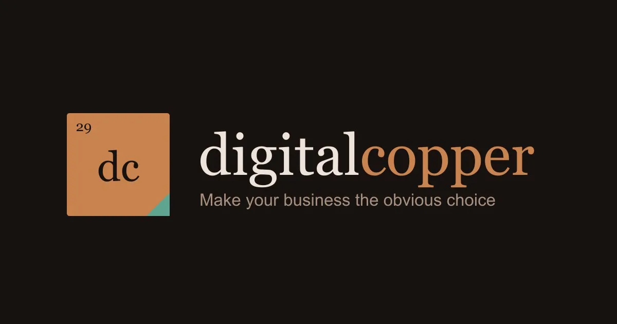
Most small businesses we meet have a logo. Very few have rules for it.
So the logo gets stretched to fit a banner. Someone picks a slightly different orange for the van. The printer swaps the font for one that looks close enough. Two years later there are four versions in circulation, and the business looks less sure of itself than it really is.
We tell our clients the logo is the easy part and the rules are what make it work. When it came to redesigning Digital Copper, it would have been odd not to follow our own advice. So this is our brand taken apart: every piece, why it's there, and the measurements that keep it the same wherever it's used.
The primary mark: an element tile
Copper is element 29 on the periodic table. Every element has a tile: the atomic number in the top corner, the symbol large in the middle, and the name underneath.
Our mark is that tile. The 29 sits where it always does. Where the chemical symbol Cu would normally go, we put dc. The name runs along the bottom.
We liked it because it explains itself. You don't need a story on the About page to decode it. Anyone who sat through a school chemistry lesson recognises the layout, even if they couldn't tell you why.
How to read the diagram
The tile is treated as 100 units wide. Every size and position is a percentage of that width, so the numbers work whether the mark is a 40-pixel favicon or a 2-metre sign. The dashed lines show where each line of text sits.
| Element | Font | Size | Position | Colour | At a 400px tile |
|---|---|---|---|---|---|
| Tile | — | 100 × 100 | corner radius 2.5 | Copper #C8834E | 400 × 400, radius 10 |
| Patina | — | legs 22.5 | bottom-right corner | Verdigris #5FA391 | legs 90 |
| 29 | Georgia Regular | 13.75 | left 8.75, baseline 17.5 | Ink #17120F | 55px at x 35, y 70 |
| dc | Georgia Regular | 40 | centred, baseline 58.75 | Ink #17120F | 160px, baseline y 235 |
| digital copper | Helvetica Regular | 11.25 | centred, baseline 86.25 | Bronze #3A2415 | 45px, baseline y 345 |
Why one corner is green
Leave copper outside long enough and it turns green. That coating is called verdigris, and it's what gives old church roofs and the Statue of Liberty their colour.
The small green triangle in the bottom-right corner is that patina. It's a quiet nod to the kind of partner we want to be: the one that's still around years later, and looks better for it.
Both sides of the triangle are 22.5% of the tile. That number comes back later, because it also sets how much space the logo needs around it.
The header lockup: icon, wordmark and tagline
The primary mark is square, which suits a social profile picture but not the top of a website. For that we have a lockup: a smaller tile, the name written out beside it, and the tagline underneath.
Three things change from the primary mark:
- The name comes off the tile. It's written out in full next to it, so saying it twice would be clutter.
- The dc moves down. Without the name underneath, dc sits at 66% instead of 58.75%, so it looks centred in the space that's left.
- The name becomes one word in two colours. It's written digitalcopper, all lowercase, with no space. The change from ink to copper does the job a space would normally do, and it keeps the name compact enough to sit beside the tile.
In the lockup, measurements are a percentage of the tile's height rather than its width. The tile is still 100 units, and everything else is measured against it.
| Element | Font | Size | Position | On light | On dark |
|---|---|---|---|---|---|
| Icon tile | — | 100 × 100 | x 0, y 0 | as the primary mark, no name | as the primary mark, no name |
| digital | Georgia Regular | 56 | x 128, baseline 60 | Ink #17120F | Cream #EDE3DA |
| copper | Georgia Regular | 56 | straight after digital, no space | Deep copper #8A5226 | Copper #C8834E |
| Tagline | Helvetica Regular | 16.5 | x 129, baseline 90 | #6B5345 | #A89080 |
Here's how that works in practice. For a header logo 60 pixels tall, multiply every number by 0.6. The wordmark becomes 33.6px, the tagline 9.9px, and the gap between the tile and the name 16.8px. Nobody has to guess, and nobody has to eyeball it.
The tagline is the line we build everything around: make your business the obvious choice.
Colour: six colours, each with one job
A palette isn't a mood board. Every colour needs a job, and it should only do that job.
Deep copper is there because the bright copper of the tile isn't dark enough to read as text on a cream background. On dark backgrounds the two swap over. That's the kind of decision that looks fussy on paper and saves arguments later.
Verdigris has the strictest rule of all. It's only ever the corner. The moment an accent colour starts turning up on buttons, headings and icons, it stops meaning anything.
Type: two typefaces, chosen for dull reasons
The 29, the dc and the wordmark are set in Georgia. The tagline and the name inside the tile are Helvetica.
Neither is fashionable. Georgia comes installed on almost every Windows and Mac computer, and so does Helvetica or its close stand-in, Arial. That means a quote written in Word, a proposal in Google Docs and a slide in PowerPoint can all match the website without anyone buying a font licence.
On the web we use Gelasio and Arimo as back-ups. Both are free on Google Fonts, and they were drawn to match the spacing of Georgia and Arial, so nothing jumps around if the first choice isn't available.
Everything is Regular weight. Nothing in the logo is bold or italic, and the letter spacing is never adjusted.
Usage: the rules that stop it drifting
This is the part most businesses skip, and it's the part that matters most.
- Clear space is the width of the green corner. Nothing gets closer than 22.5% of the tile on any side.
- It shrinks in steps. The full primary mark is used at 64 pixels wide or larger. Below 64, the name comes off. Below 32, the 29 goes too. At that size, only the tile and the dc are clear enough to read.
- Colour stays flat. No shiny metallic gradients and no shadows. Gradients look impressive on a big screen and muddy on a van, a newspaper ad or an embroidered polo shirt.
- Green is only ever the corner. Never text, never a button.
- The name is one lowercase word in the logo. digitalcopper, every time.
None of these rules are clever. They're written down, and that's what makes them work.
What this means for your brand
The mark is simple on purpose. What makes it a brand rather than a logo is the page of measurements behind it, and the fact that we keep to them.
That's what we build for our clients too. Not just a logo, but the colours, type, spacing and photography around it, written in plain English so your website, quotes, signage and social posts all look like they came from the same careful business. You can see how that works on our brand identity page, or read why your logo isn't your brand.
If your business has drifted into four versions of itself, book a 30-minute call. We'll tell you honestly what it needs.
Want the quick version for your own website? Run the free report, or request a 30-minute call if you already know the site needs proper management.